State of SaaS
Onboarding 2022 Report
Every year, Team Userpilot manually reviews the onboarding flows of over 100 SaaS applications.
For this edition we focused exclusively on B2B companies in the MarTech Industry for the most comparable benchmarks.
State-of-Saas-Intro

Why should you read this report?

State of B2B MarTech SaaS
State-of-B2B-MarTech-SaaS
Source: Fairmarkit

The Importance of
User Onboarding

The ‘set it, and forget it’ attitude can backfire:

Improve your user activation

Improve user activation with interactive onboarding flows!
Userpilot-onboarding-flow

Free Trial vs. Freemium vs. Demo

Of the MarTech SaaS companies we investigated, most had a freemium model and very few of companies in the study didn’t offer their prospects a ‘taste of the product’.
Free-trail-and-freemium-chart
Insights

More and more companies are aware of Product Led Growth and use their product as the acquisition channel.

Play Video

Frictionless Signup Flow

There’s friction, and then there is friction. Sometimes, adding some extra friction to deter the people who wouldn’t be the right fit for your software can be a good thing read more about how to design your sign up flow here.
But unintended friction translates into bleeding prospects during the signup flow. Even the most determined ICP will choose a product that gives them the same functionality at the same price if it means jumping through less hoops.
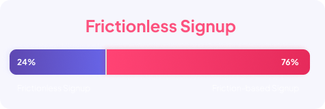
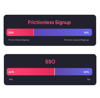
In the State of SaaS Onboarding 2022 report, we defined “frictionless signup” as asking the user for just the name + email, and not requiring email confirmation before accessing the dashboard.
Frictionless-Signup-Flow
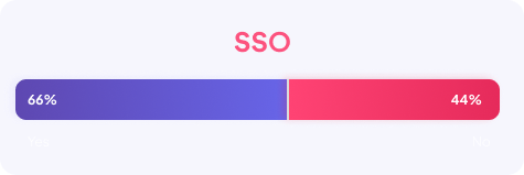
SSO-signup-flow
Insights

Quick tips for reducing friction in your sign up flow:

  • Avoid asking the user to confirm their email address before getting to see the dashboard.
  • If you need to confirm your user’s identity or email address, do it after they get to interact with your product, e.g. when users are creating an email campaign, ask them after they have built their first campaign, and before they hit the ‘send’ button.
  • Same with asking your users additional questions in the signup flow - ask only the ones you immediately need to use to personalize your new user onboarding flow.
  • Use Single Sign-On (SSO) to make the signup process easier for your new users.
Play Video

Welcoming Your Users

The way you greet your users can set expectations for what’s coming up next in their onboarding and how they can get the most of your product.
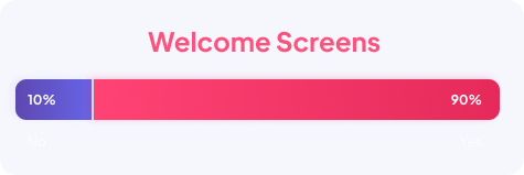
How many MarTech SaaS products have welcome screens in 2022?
Welcome-sequence-userpilot
Insights

You can add fun GIFs, personalized touches with {first-name} tags, but


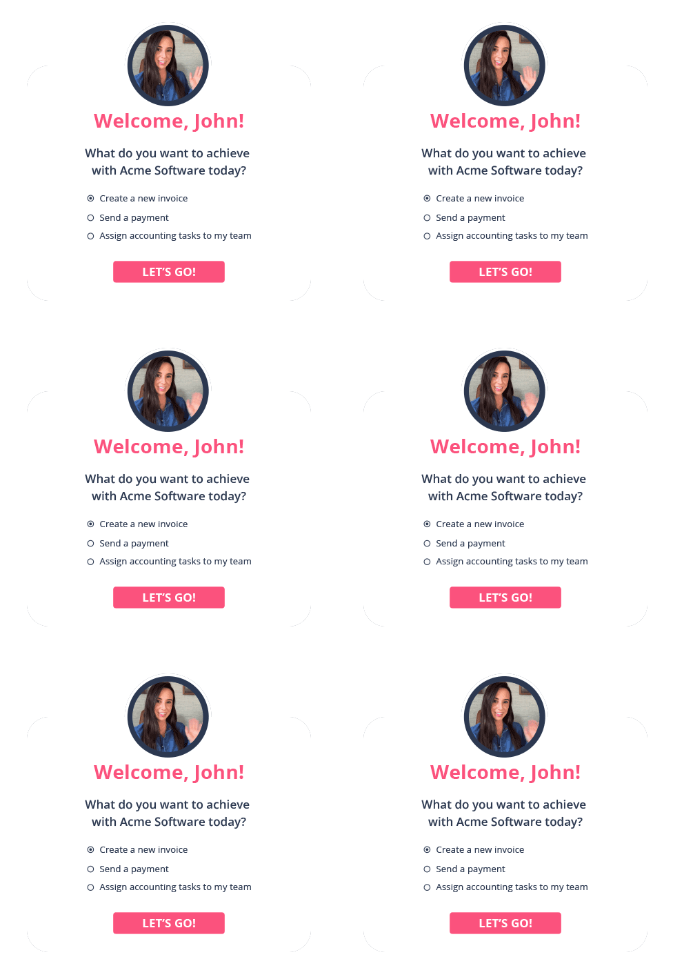
Using the welcome screen to segment your new users by the goals they want to achieve can be game-changing. You will get them to accomplish their Job-To-Be-Done faster, reduce their time-to value, and generally help them activate much sooner than if you drag them on a one size fits all 20-step-long product tour.


It’s a win-win - your users will get value faster, and you will retain and convert more trial users.


You can do this by asking your new users 1-2 questions about what they want to accomplish, or adding buttons that would allow them to “choose their own journey”:


Play Video

Start Building for Free

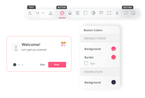
Start building welcome screens code-free
Welcome-screens-userpilot

Microsurveys in the Welcome Flow

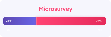
Microsurveys in your welcome flow can significantly reduce time to value and increase trial-to-paid conversion rates.
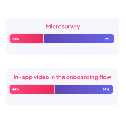
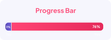
No wonder 76% of MarTech SaaS companies used some form of microsurveys.
Microsurvey-state-of-saas
in-app-video-onboarding
Insights

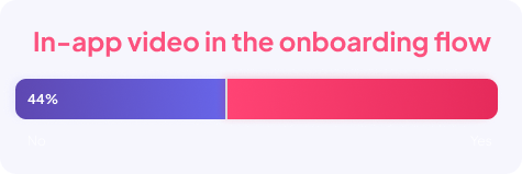
Here are some best practices of using videos in your welcome flows:

  • Use only short (< 1-2 minute clips)
  • Don’t use video tutorials as a replacement for interactive walkthroughs that take users through the required actions first-hand - only use video to enhance them.
  • Use video whenever it makes more sense to show rather than tell.

Onboarding Guides, Product Tours and Interactive Walkthroughs

Expecting that your users will ‘somehow figure it out’ after first logging into your product is the modern equivalent of “build it, and they will come”.
Of course some will figure it out. But what about those who won’t?
To improve your new users’ activation rate, you need to show them how to perform the key actions (key activation points) they need to experience the value of your product.
There are two main ways to do it: linear product tours, and interactive walkthroughs.
If you want to learn more about product tours vs. interactive walkthroughs – watch the video below:
Play Video
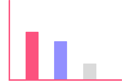
Product tours point out the elements and steps users need to take in a series of tooltips or modals on the user’s screen. The user can usually quickly click through or dismiss tours easily. The downside of traditional, linear product tours is that they front-load all the information and increase the user’s time to value.
Interactive walkthroughs on the other hand, take users step by step to perform the key activation points, at their own pace. Sequences of the onboarding process show only after the users have successfully completed the previous steps.

Interactive Walkthroughs vs Product Tours
interactive-walkthroughs-chart

Onboarding Optimizations
- Checklists and Progress Bars
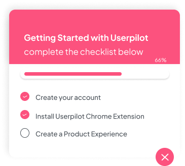
Last but not least – there are certain small optimizations you can implement to make your onboarding even more effective.
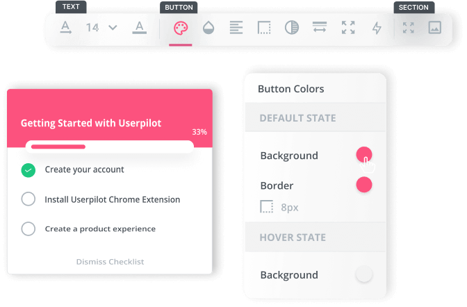
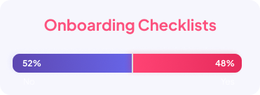
For example, adding an onboarding checklist, ideally with a few items already ‘ticked off’.
checklists-at-userpilot
Onboarding-Checklists
Progress-Bar
Play Video

Final thoughts

You’re now updated on some of the latest trends in user onboarding in SaaS! We hope you were able to take away some inspiration for how you can improve your user activation, first-month retention, trial-to-paid conversion, and other product metrics.

Ready to Level Up your User Onboarding

Measure, Experiment and reduce time to value for new users!
onboarding-userpilot-features

G2 Market Leader 2022

Userpilot is an incredible, user-friendly software that allows us to create unforgettable experiences for our clients! From basic to complex experiences, we have been able to do them all with ease!

I would highly recommend this software to anyone who wants to provide their clients or users with the best product tour experience. The possibilities of what you can create are endless!

userpilot-at-g2
View more
@UserpilotTeam We chose Userpilot because it offered the most bang for your buck. With the help of Userpilot’s driven actions, we created a seamless experience directly engrained with SciNote, which provides our users the ability to master it quickly and most importantly easily. But what we really love is the attention and support we receive from them. Their team strives to help us succeed in educating our users and are always there for us if we hit any snags on the road.
Matjaz Muhic
@Scinote
@UserpilotTeam Easy to use. Requires very minimal dev work to add new experiences. Empowers me as a product manager to do more without needing others to implement. Love the in app experience builder, WYSIWYG on steroids. We use it for contextual product education, NPS surveys, onboarding /activation walkthroughs, upgrade experiences, etc.
Emma Yee
@Osano
@UserpilotTeam  Within minutes of signing up, we knew we found the right tool. It’s super intuitive, powerful and most importantly, the support is 10/10. We’re continuously ideating, validating and implementing our onboarding experiences with Userpilot without bothering the development team and that saves us a lot of time.
Fahad Iqbal
@Fliplet
@UserpilotTeam It’s a very intuitive and fun to use platform. Provided all the tools that We needed to improve our users adoption. We’ve had great feedback from our costumers. We were able to make a very significant leap in the adoption of the new functionalities with the customers, making a process that was slow and boring, into something fun and fast to implement.
Miguel EspĂ­rito Santo
@GoContact